
We are told not to judge a book by its cover, but readers do it every day. On an online store, your cover is often the first and only thing a potential reader sees before deciding whether to click. A professional cover signals a professional book. Here are seven principles our designers follow on every project.
1. Know your genre and meet reader expectations
Every genre has a visual language. Thrillers often use bold type and dark, high-contrast images. Romance leans on warm colours and characters. Fantasy features rich illustration, and business books favour clean, confident typography. Study the bestsellers in your category. Your cover should feel like it belongs there while still having something that makes it unique.
2. Make sure it works as a thumbnail
Most people discover books on a screen, where your cover may be shown at the size of a postage stamp. Before approving a design, shrink it down. Can you still read the title? Is the main image still clear? If not, simplify.
3. Choose one strong focal point
A cover crowded with lots of small elements becomes confusing. The strongest covers usually have one clear focal point: a character, an object, a symbol or a striking typographic treatment. Let that element tell the story at a glance.
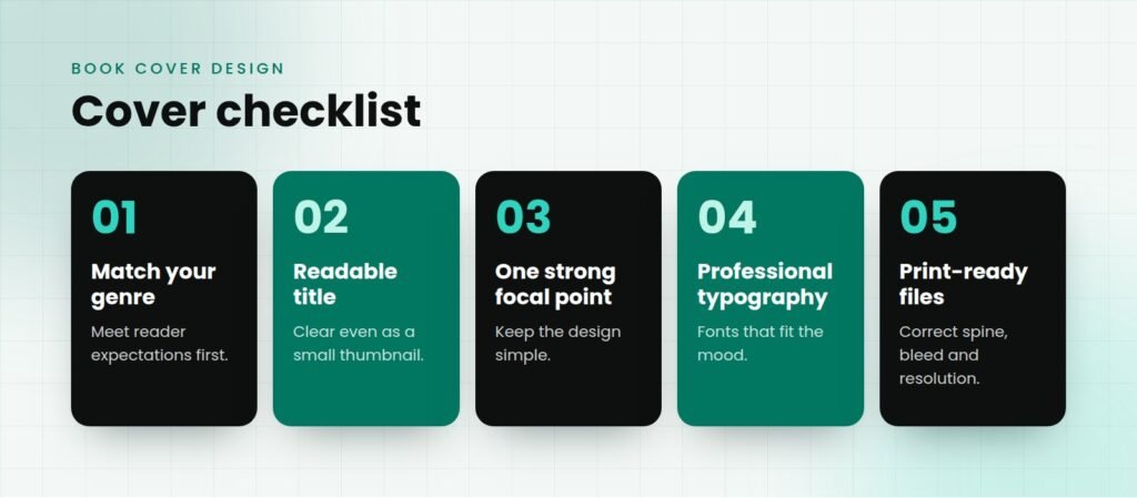
4. Use typography that fits the mood
Fonts carry emotion. A delicate script feels romantic, a heavy sans-serif feels modern and bold, and a classic serif feels literary and trustworthy. Limit yourself to one or two typefaces, and give the title enough size and contrast to stand out from the background.
5. Use colour with purpose
Colour is one of the fastest ways to set the tone of a book. Choose a palette that suits your genre and stands out next to competing titles. High contrast between the text and the background helps both readability and shelf appeal.
6. Don’t forget the spine and back cover
If your book will be in print, the full wrap matters too. The spine should be readable on a bookshelf, and the back cover needs a compelling description, a short author bio, space for the barcode and, ideally, a strong review quote. Everything should feel like part of the same design.
7. Get the technical details right
A beautiful design can still be rejected by a printer if the files aren’t prepared correctly. Print covers need the right trim size, spine width, bleed and high-resolution images, while eBook and audiobook covers have their own size requirements. A professional designer will prepare every version for you.
Give your book the cover it deserves
Your cover is one of the most important marketing tools you will ever have. Our designers create custom, genre-perfect covers and deliver print-ready full wraps plus eBook and audiobook versions, with revisions included. Learn more on our Book Publishing page or contact us to start your cover.