

E-Commerce Website Redesign
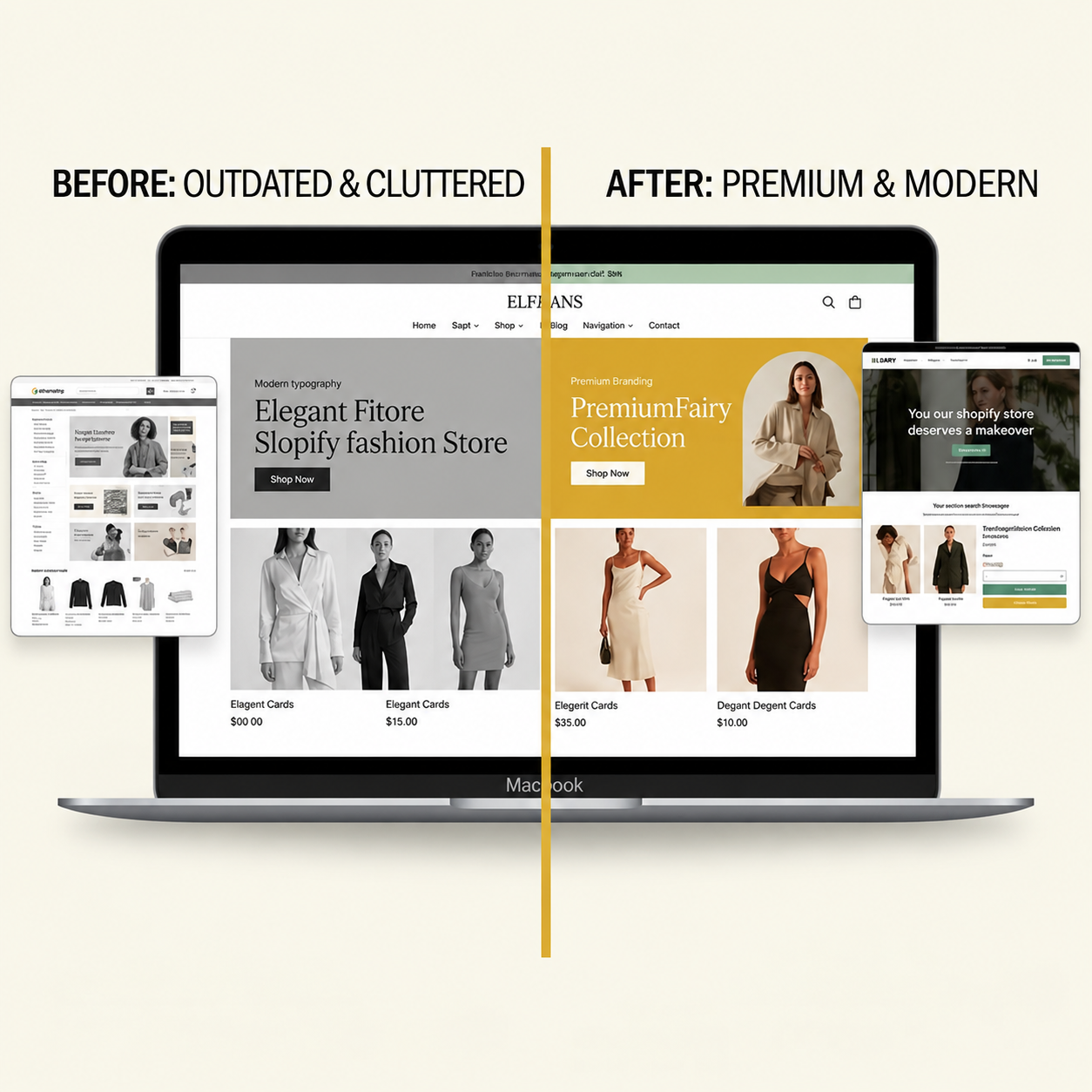
From cluttered to conversion-ready.
- ClientOnline fashion boutique
- ServiceWebsite Design & Development
- ScopeUX audit, UI design, responsive build
- PlatformDesktop, tablet & mobile
- FocusBranding, product presentation, customer journey
An outdated online store became a clean, premium shopping experience — with stronger branding, clearer products and a journey that makes buying effortless.
We redesigned the store from the ground up. Every page was rebuilt around the customer: bold, on-brand visuals, product layouts that let the collection shine, simple navigation and a fully responsive design that feels just as premium on a phone as it does on a laptop.
A store that didn't match the brand
The original website felt dated and busy. Products were hard to browse, the layout lacked hierarchy and the overall look didn't reflect the quality of the collection.
Premium, simple & brand-led
We created a clean visual system, larger product imagery, featured-collection banners, clear calls to action and intuitive navigation — designed mobile-first and built to be fast.
A store customers enjoy using
A modern, consistent storefront that presents every product professionally, builds trust at first glance and guides visitors smoothly from browsing to checkout.
Everything the store needed to stand out.
- UX audit & customer journey
- Visual identity refresh
- Homepage & collection pages
- Product page design
- Responsive mobile experience
- Speed & SEO-friendly build
Products that shine
Large, clean product imagery, featured-collection banners and clear prices, so every item looks as premium as it really is.
Effortless navigation
Simple menus, smart categories and search help shoppers find what they want in a few taps, without the clutter.
Mobile-first shopping
A fully responsive store that feels just as premium on a phone, from browsing the collection to checkout.